2degrees
A fresh spatial experience for 2degrees and a seamless retail customer experience.
Spaceworks was engaged from the moment a re-design was a possibility. From that point we were involved in the ideation, retail strategy, design conceptualisation, stakeholder engagement – right through to design development, construction and handover.
With a project like this there are multiple product lines, which bring multiple stakeholders. The overarching client brief was to create a flexible and future proofed retail space to ensure the continued growth of 2degrees as a telco and the ever-changing technology of the industry. A space that balanced between maintaining their core brand essence and relatability to their customers; the cheeky, playful, humble, underdog, but with an elevated refined touch, to reflect their growth and development as a serious player in the telco marketplace.
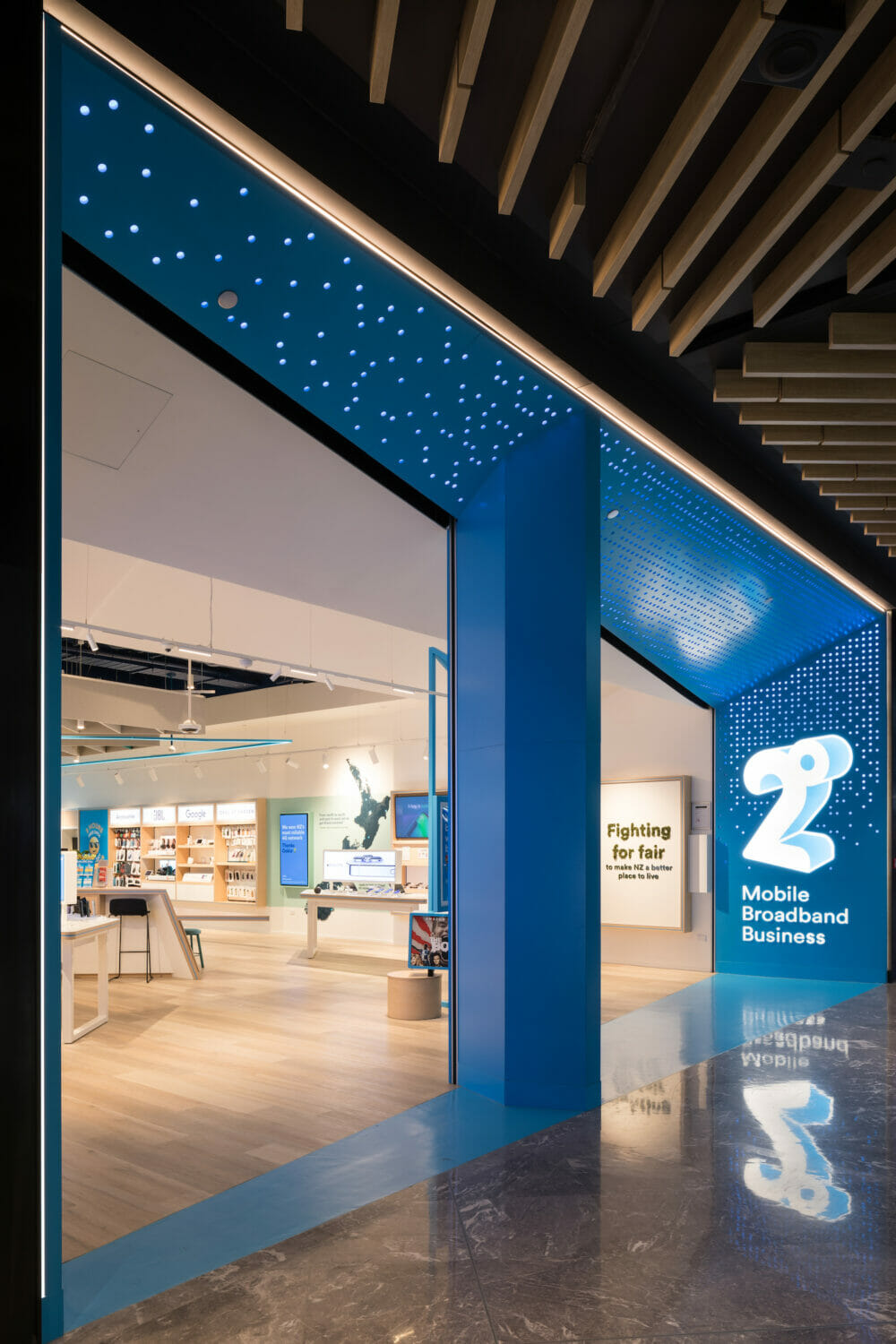
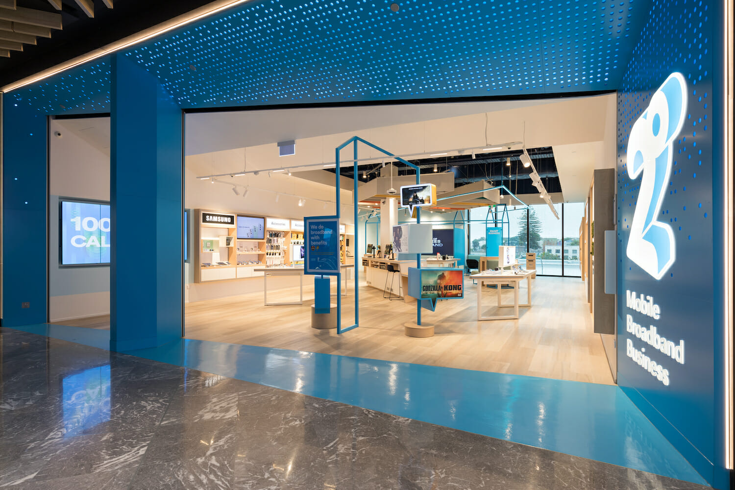
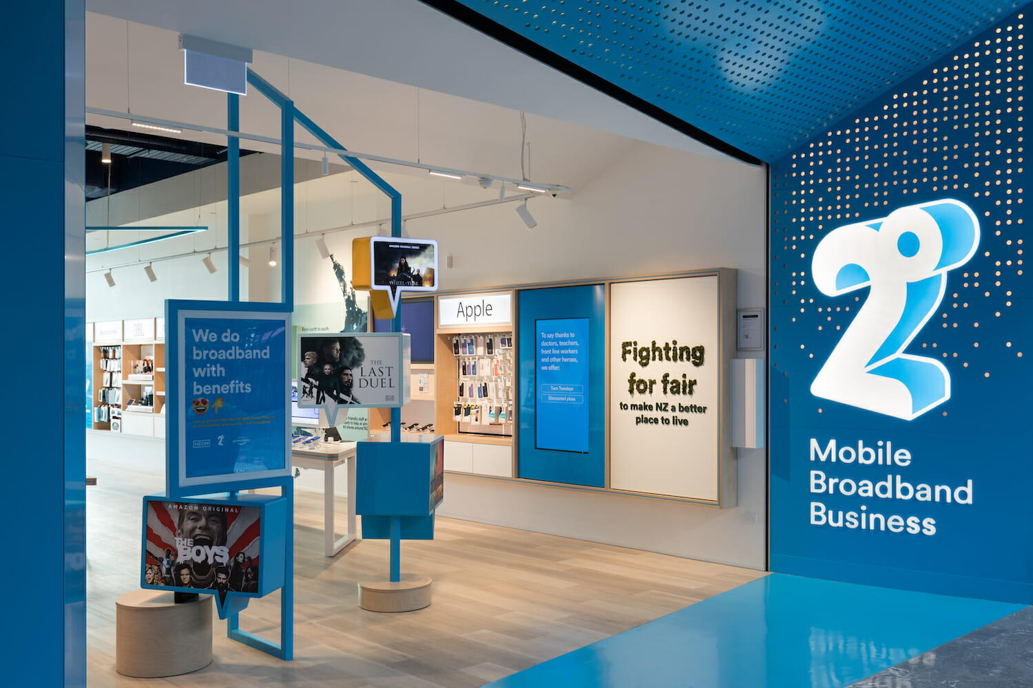
The customer is welcomed by a bold visual brand presence through the expansive blue entry portal that frames the lighter and brighter interior; naturally drawing the customer in to explore. The impressionable shopfront, showcases a dynamic angularity with the brands iconic hero blue alongside an integrated graphic pattern of perforated dots (a subtle nod to the degree symbol), strategically spaced so that when activated the portal is flooded with various sequences of coloured light dancing across the entry, enticing customers nearby and afar. The theatre of colour and light generated within the innovative illumination sequencing, links to the 2degrees brand and further heightens the immersive and vibrant customer experience as one enters the 2degrees retail environment
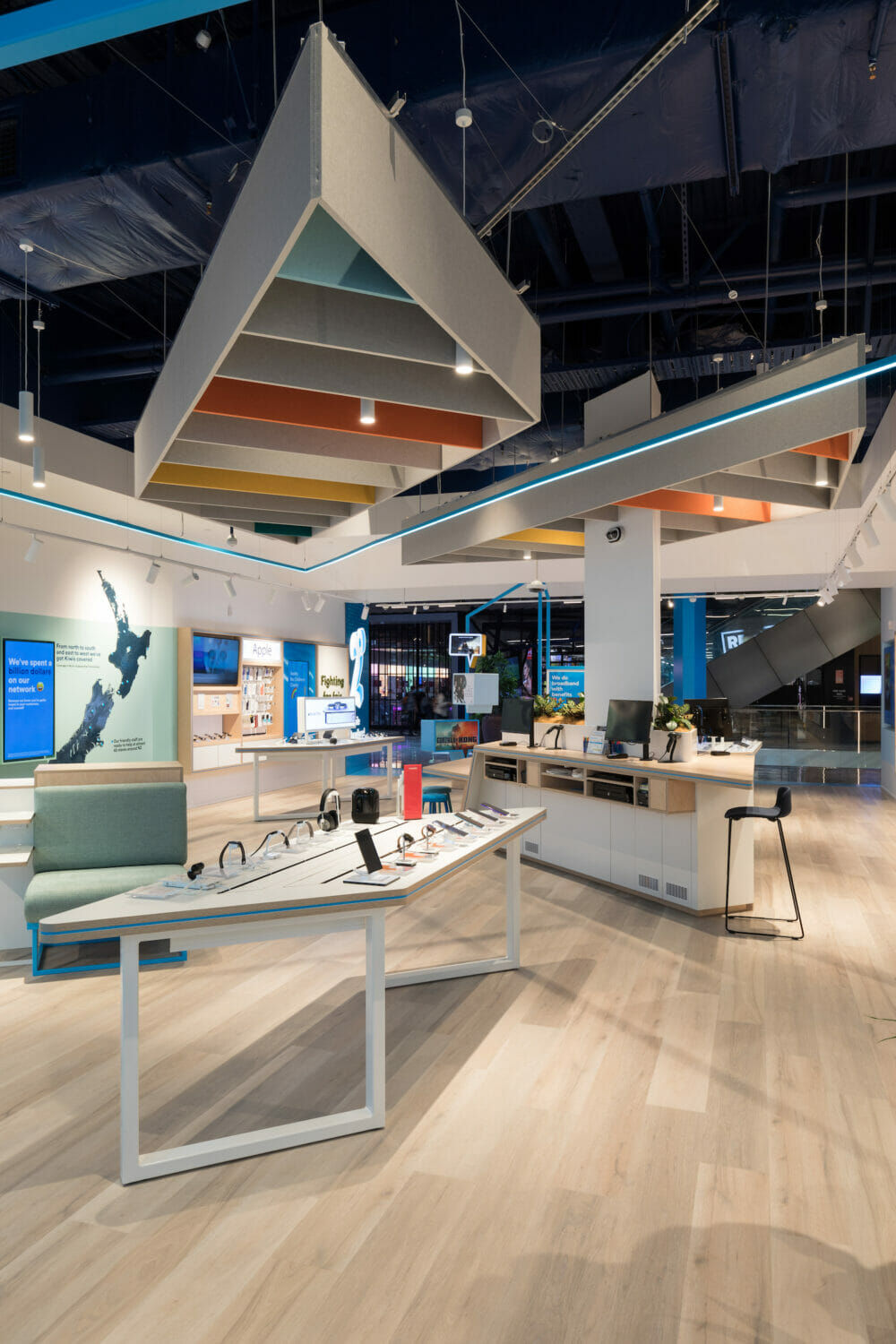
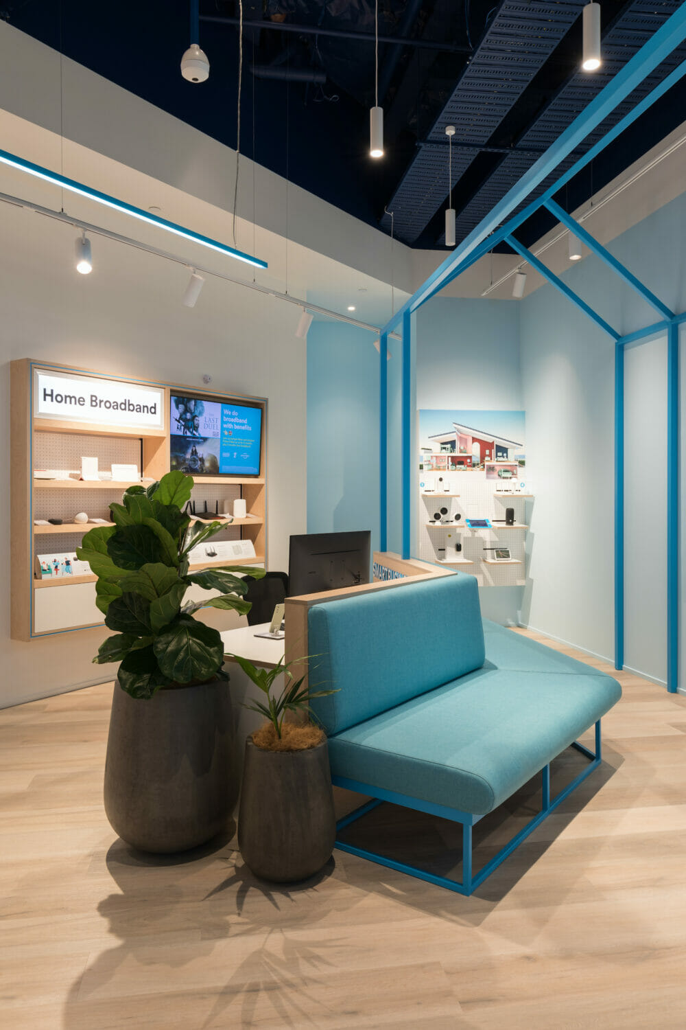
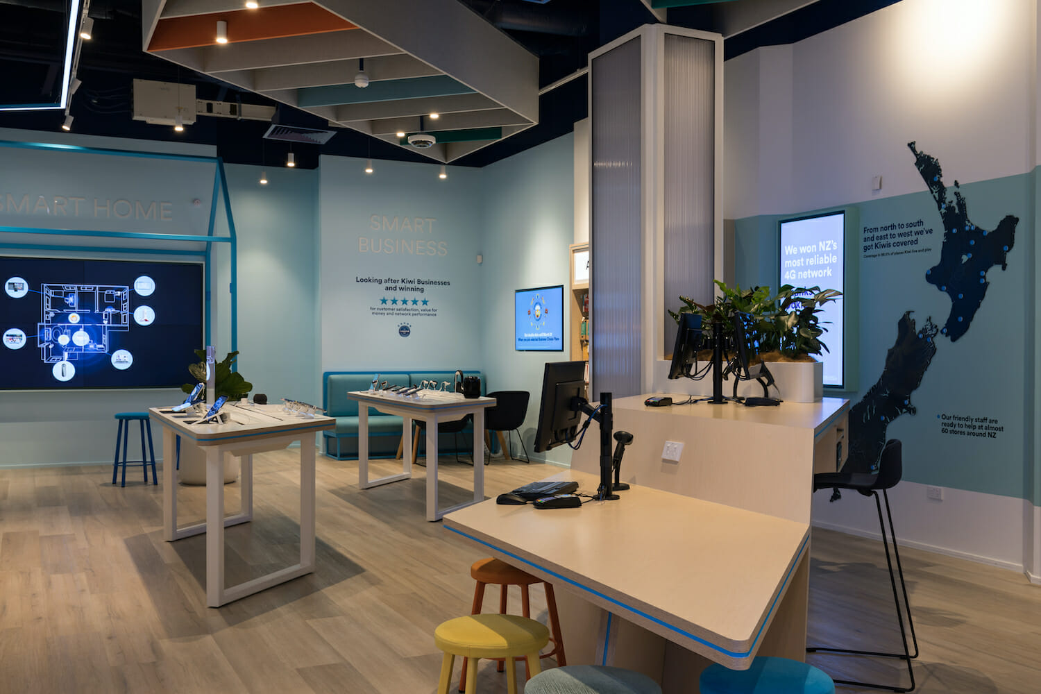
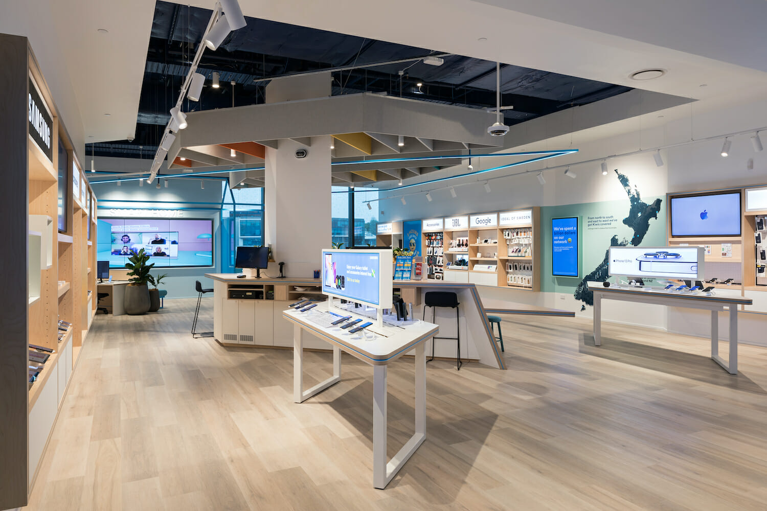
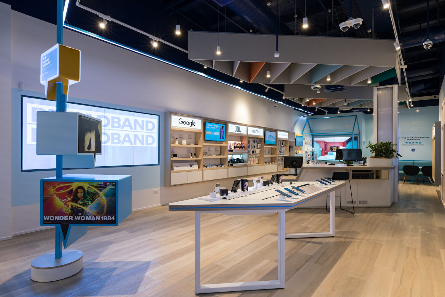
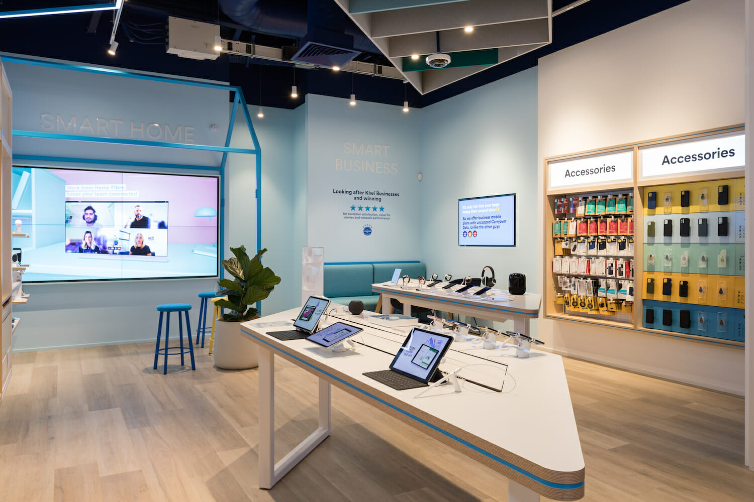
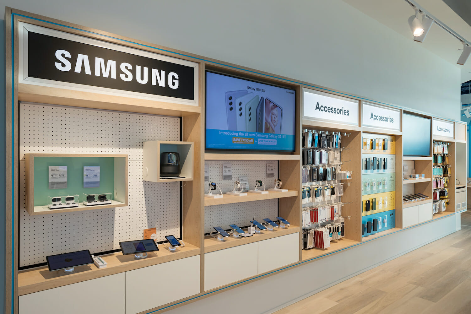
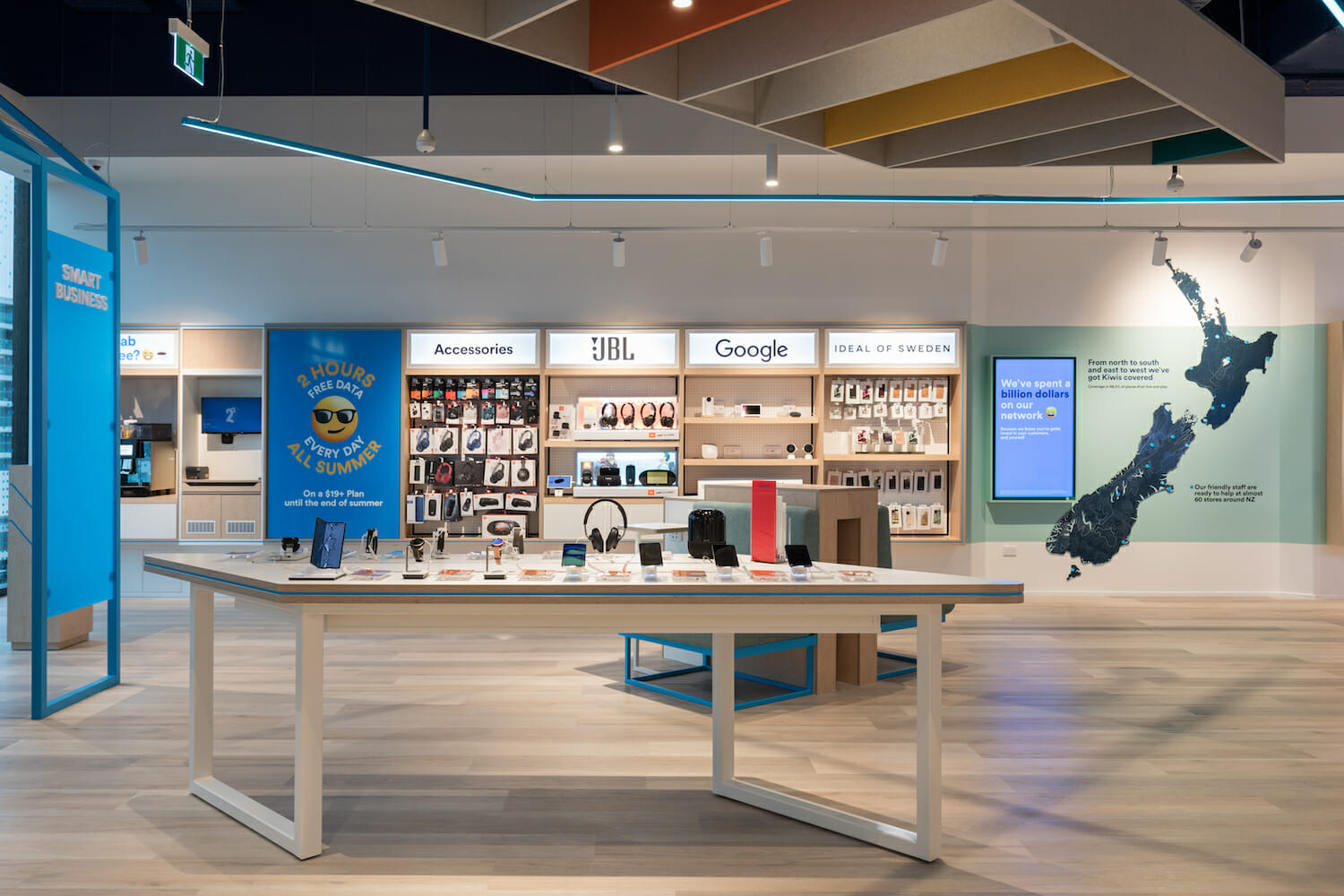
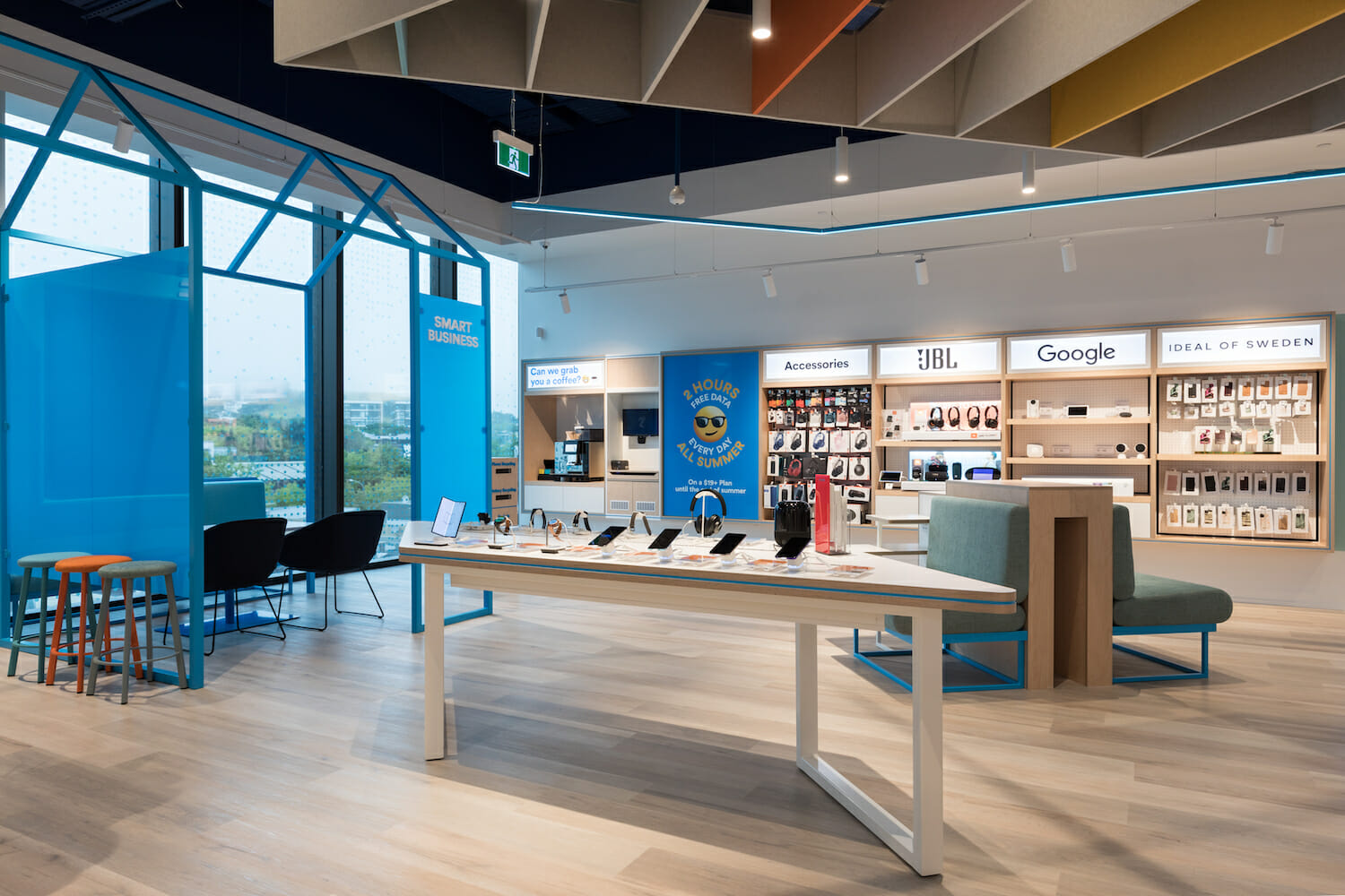
The design of the store within creates a spatial experience that allows the visitor to move around the interior, led by their own curiosity as they are guided through carefully curated occasions of form and colour. The designed fixtures allow the vast amount of product the client needed to display, to be presented in a way that that could be visually curated while allowing ample visual breathing space; offering visitors a sense of visual relief. The spatial flow was strategically considered in and around the fixtures to ensure customers could stand, sit, and dwell to interact with and experience the product within the fixtures, without disrupting the flow of moving customers within the store.
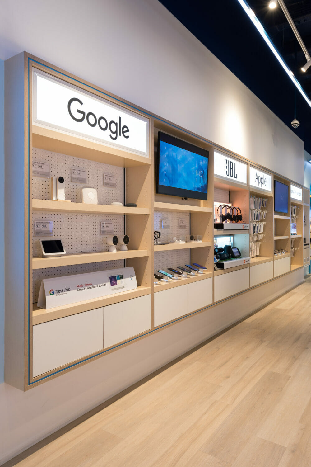
The integration of brand features assist in maintaining the playful voice of 2degrees, blending seamlessly with the clean lines of the store; recessed mounted wall bays float above the neutral timber flooring, crisp white walls and clearly defined spotlighting perfectly illuminates the product and create a bright but theatrical interior space; elevating the store to a vibrant yet refined representation of the 2degrees brand.
Credits:
Datum Projects, Crestline, Kada, Outside In, Harrows, National Signs, Targetti, Mark Scowen Photography
Let's discuss your next project