
How Design has changed over the past 21 years
As its birthday month we are looking at all things 21 that relate to Spaceworks and design.
Whilst I have not be at the helm the full 21 years, I have been the CEO for 15 and prior to that an employee for 2 years. In a nostalgic moment I chose to reflect on how design has changed in this past 21 years in the commercial sector.
2000 – We were still very much in love with individual offices, and they were placed in hierarchy. Size and location was dependant on seniority. There was some open plan but it was more cubicle, very much a desk and chair for the general office. Front of house reception was formal and often secure with security access in the working area of the office. Design was reserved for the client facing areas and in 2000 the general rule of thumb was charcoal + white + your corporate colour; thank goodness this has moved on.
2005 – People start to migrate out of offices, but not senior management. More people are now in cubicles, but these cubicle walls are becoming slightly lower and more inclusive.
More importance is starting to be put onto having good staff kitchen and facilities. This is a time when treadmill desks did the rounds. Thankfully they have not become super popular, but with some die hard fans the balance ball still exists.
2010 – The pathway out of the GFC brings a mixed bag. On one hand lots of businesses are moving to open plan and hot desking to save floor area/costs. Hot Desking becomes a buzz word and is not desired by those who have to use them. Desks are smaller and privacy is less with cubicles becoming more open. Co – working spaces started to arrive in NZ, which started to change the way we understand social space, collab space – it was instrumental in showcasing how many people with different needs could cohabitate in open environments.
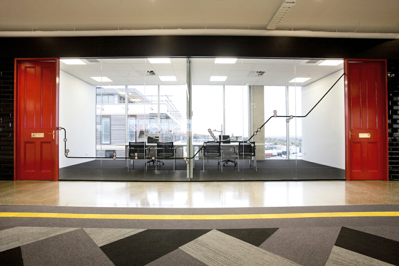
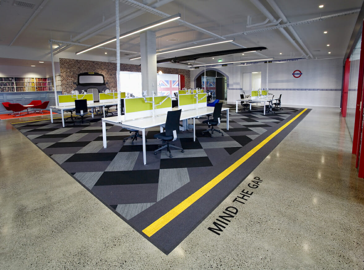
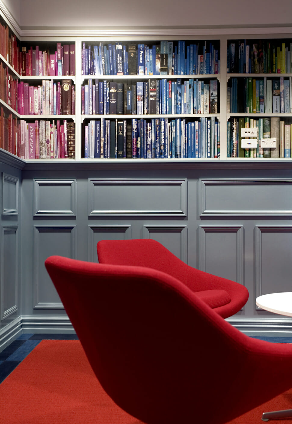
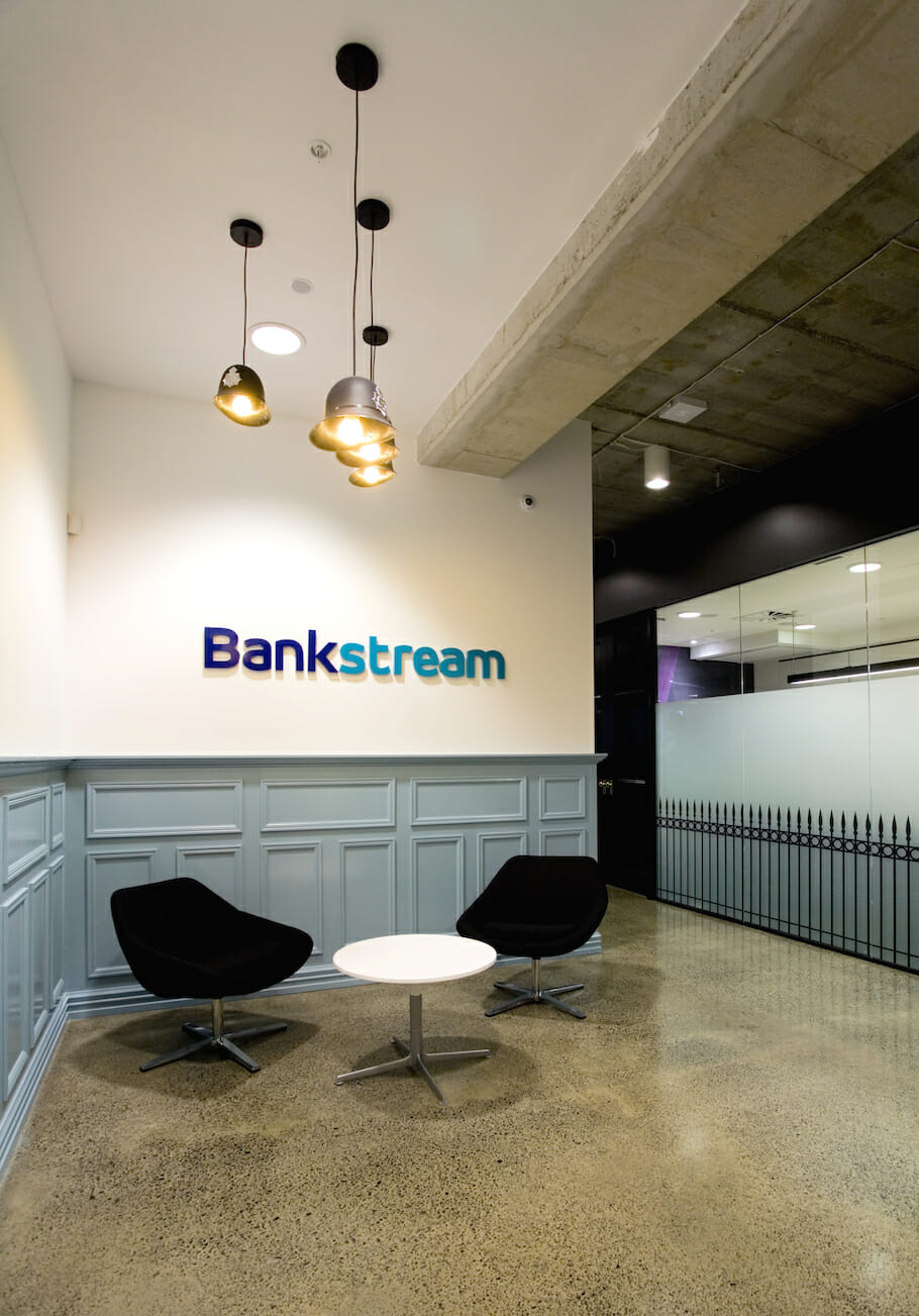
2012 – Post GFC, make way for the office gimmicks, the entertainment, from pool tables to foos ball. From climbing walls to slides in the office. You name it, design was all about being fun – Google lead the charge on this. This was also the time of themed fitouts, we did a couple ourselves, one was Bankstream that had a UK office – so it was London inspired. See pics. Activity based working becomes a principle many start to incorporate, whilst its been around for years its more of a consideration for SMEs too.
2015 – Plants have made a big come back. Gimmicks are staying strong although the importance of flexibility in the workplace is more popular. Spaces that are multi-functional, that transform and can be used more often – often called third space. Kitchens are far more open and a café culture is developing. This space becomes far more open and becomes the heart of a good office. Wellness starts to feature, with most corporates pushing the workers to the light and good air – segregation between front of house and back of house is fading away.
2017 – Remote working is coming onto the scene, along with a lot of talk about Millenials – what their needs are and how to meet them; especially as they are a generation raised with technology. Filing rooms are gone in favour of cloud based solutions. This is also when we see an uptake in booth seating and a much wider range of working options – high tables / couches / booths / communal tables. There was also a further surge in genuine sustainability in the office, lots of cool recycling options and a further push for paperless.
2019 – Pre pandemic was all about talent, businesses realised that their staff were as important as their clients. This lead to integrating wellness, yoga classes, fruit bowls, boot camps you name it. Collaboration is the buzz word of the moment as is flexibility & technology. Design is continuing with natural materials being a strong preference, timbers, concrete, natural colours. Plants are everywhere and look here to stay.
2020 – The pandemic pushed businesses to test their infrastructure, could their teams actually work from home, would their technology and systems stack up. It was all about the home office and how to make this feel inspiring and inviting. Post pandemic many businesses looked at how they could incorporate working from home and working from the office as a hybrid model. Some businesses have reduced their footprints in favour of this hybrid model. Light and bright seems here to stay, its about feeling lighter when you come to the office. A combination of old and new.
2021 – If you are currently in Auckland, you are in lockdown, but before this – office design is a further development on what we saw in 2021. Businesses are appreciating the importance of the office for connection and collaboration. Its not a surprise that some businesses are reducing desks in favour of more collab areas and communal working, with the additional of working from home should people require focus time. Design is human and wellbeing centric, it requires great technology solutions and flexibility – although the flexibility in 2021 is less about the space and more about the flexibility in time and attendance in the office.
Key design elements that feature now are:
- An abundance of greenery
- LED lighting
- Lots of natural light and natural airflow where possible
- Soft colours, continued use of natural materials
- Technology that allows people to move through space, allowing them to choose where they want to work
Right now there is a real understanding and appreciation that the office is the heart of any business, it is the place we look to connect, collaborate and foster culture and community. I am intrigued to see where we land design wise in another 21 years.
Lizzi Whaley
CEO
