
Education Project – Auckland Normal Intermediate
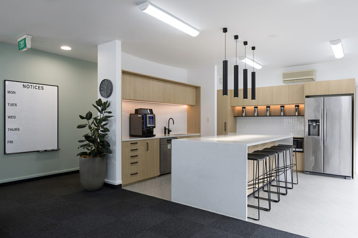
Recently we completed an admin block upgrade and a Makerspace for Auckland Normal Intermediate.
There is nothing better that seeing a space totally transformed through the simple application of colour, texture and materials.
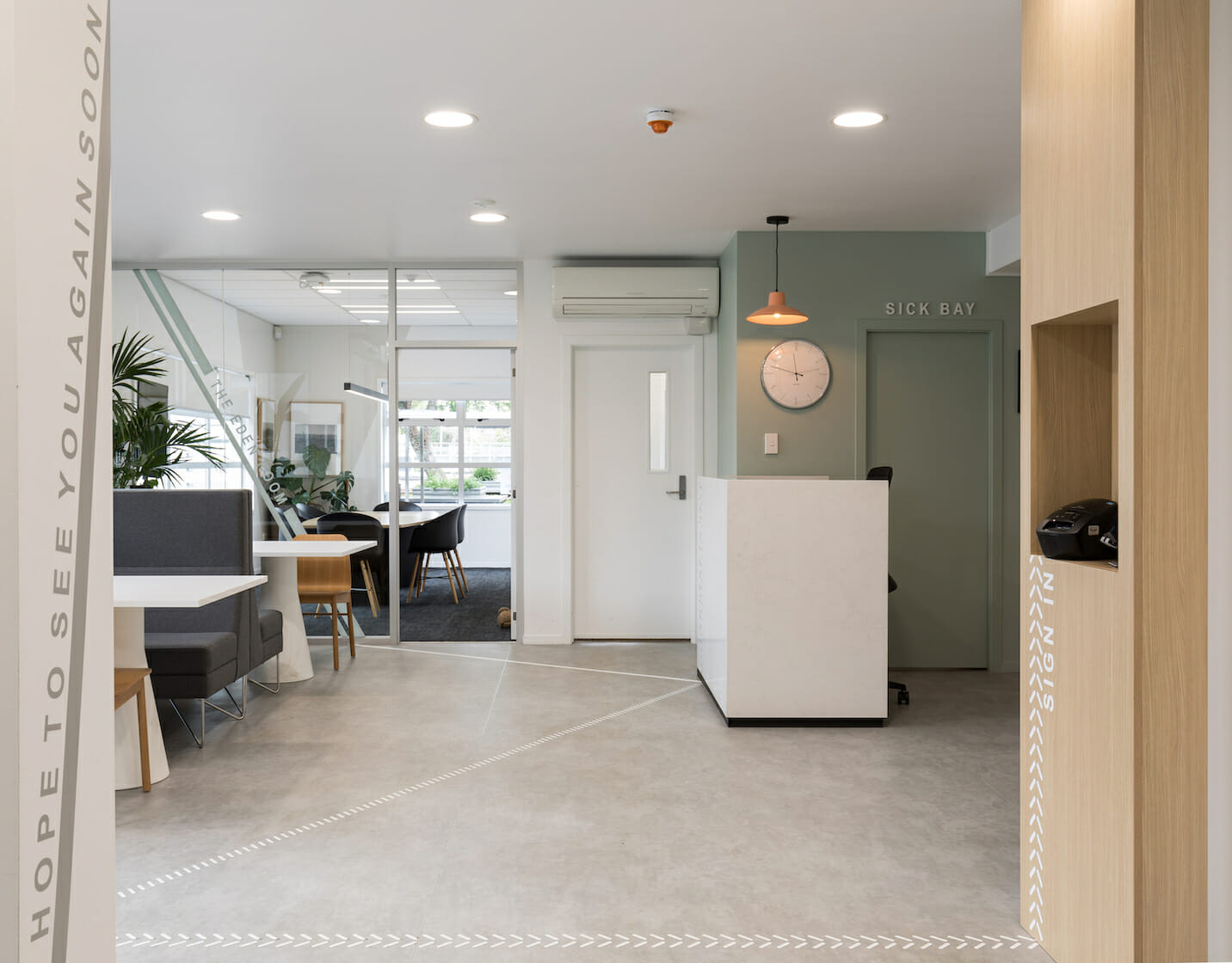
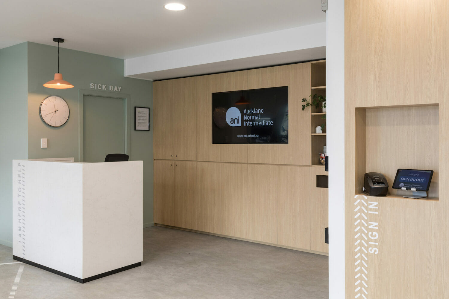
For the Admin block we were refurbishing their existing space, which included a reception area that was to accommodate external visitors, parents, staff and students. The brief was that it needed to be both sophisticated yet playful, welcoming and professional. The palette for the space was taken from a Tapa cloth that was originally hung in the admin area. Colours and textures were drawn either directly from this art piece or provided inspiration for other complimentary colours used.
Gone is the big cumbersome reception counter we are all familiar with at schools, instead you are greeted much like a hotel with a concierge desk. A meet and greet desk where you have someone on your level.
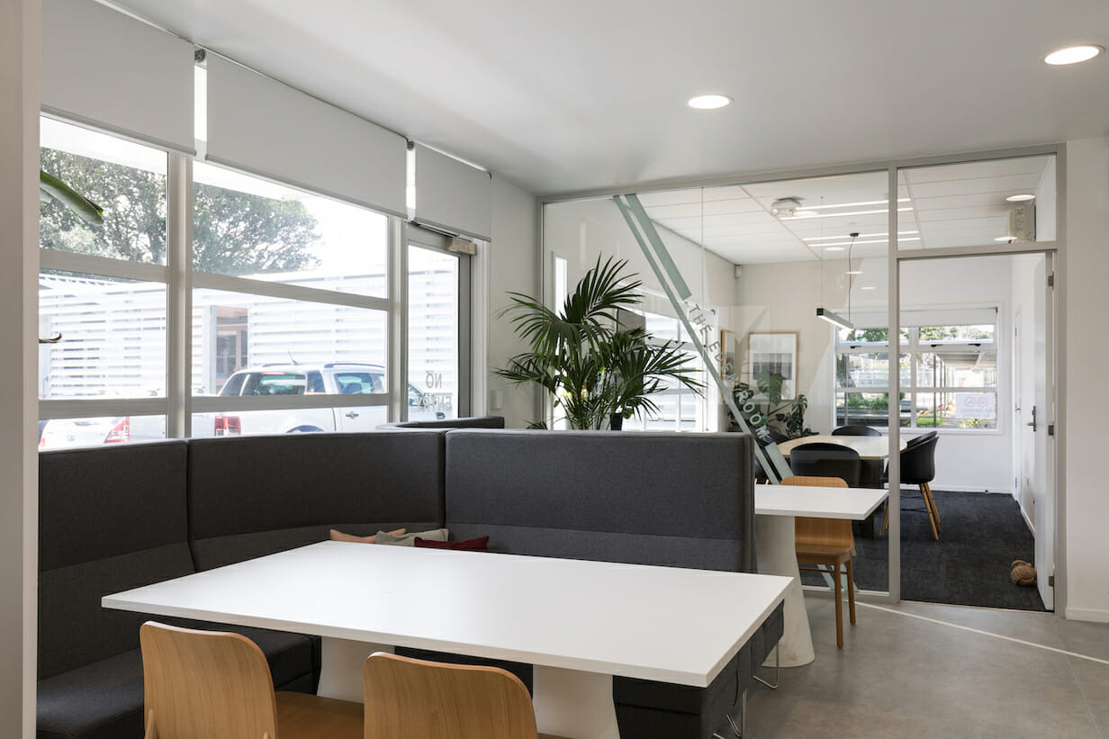
In this space there is a closed meeting room that is used frequently. Historically this has been called the Eden room, a nod to the location of ANI being in central Mt Eden. The concept for the interior of this space included playing this up further, including historic images and graphics of the local area.
Within this upgraded reception area we included a number of seating areas in the common space, with the intention that it could be used as either a waiting area or for more informal meetings to occur. Embracing what is commonly now incorporated into commercial offices – a break out space or impromptu meeting /collab spaces.
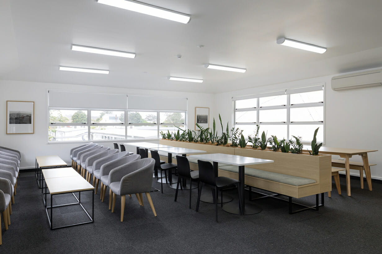
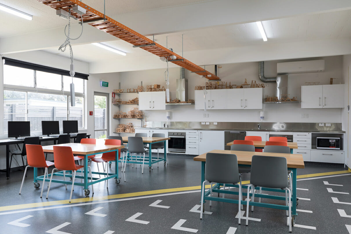
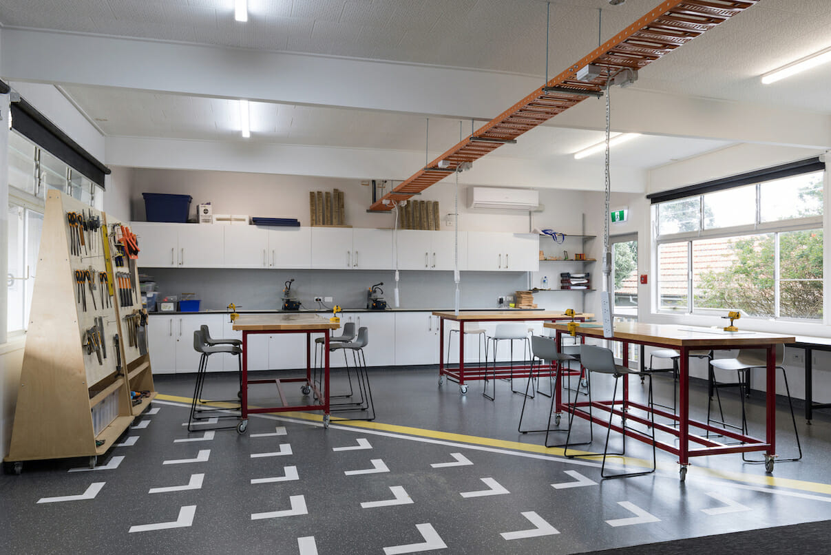
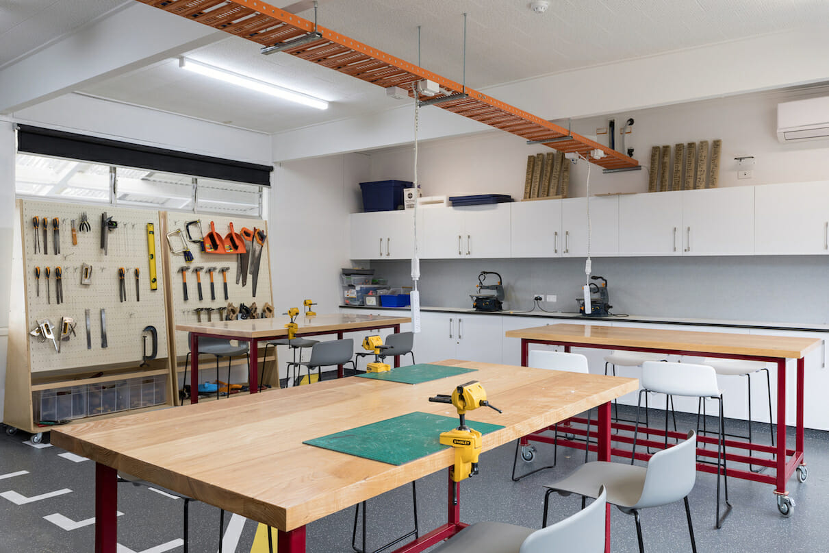
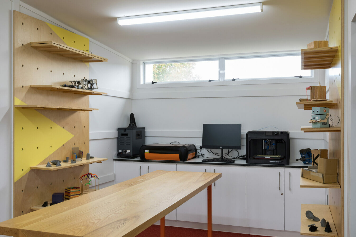
We also created an exciting Makerspace environment, where students learn the specialist subjects; Food, Science, Art, Music & Drama. The inspiration for this space was based on the Auckland University Unleashed space that we created. We were to bring the same energy and vibrancy into what we created for ANI.
Functionally the brief was to be flexible; easy so for teachers and students to be able to re-arrange with ease. Joinery is purpose designed and built, allowing the space to pack away to be open and clear. Aesthetically the demand was more intangible – this space was to be inspirational, playful and draw students to want to engage and hang out here.
The design is dynamic and colourful, it has a vibrancy and energy to it that influences its tween users & teachers. It has been successfully reported to be a positive environment to spend time in and has beneficial impacts on enhanced learning and engagement.
Lizzi Whaley
CEO
