
2degrees
2degrees Store – Interior Design by Spaceworks
The Spaceworks team was thrilled to design the flagship 2degrees store in Newmarket, Auckland. Our goal was to create a retail space that truly reflects 2degrees’ brand identity while enhancing customer engagement and experience. Every design element—from layout to lighting—was carefully considered to ensure a seamless, future-proofed retail environment.
The Client Brief
Designing a flagship store for 2degrees meant balancing multiple product lines and meeting the needs of various stakeholders. The goal? A flexible, future-ready space that supports 2degrees’ continued growth in the telco industry.
The design needed to retain 2degrees’ signature brand personality—cheeky, playful, and humble—while introducing a more refined, sophisticated feel. The store was envisioned as a hands-on experience, encouraging interaction, connection, and community.
The Design
This flagship store offers a vibrant and immersive retail experience, combining thoughtful design, dynamic lighting, and strong brand storytelling. From the moment customers arrive, the space is designed to engage and inspire.
The Entrance
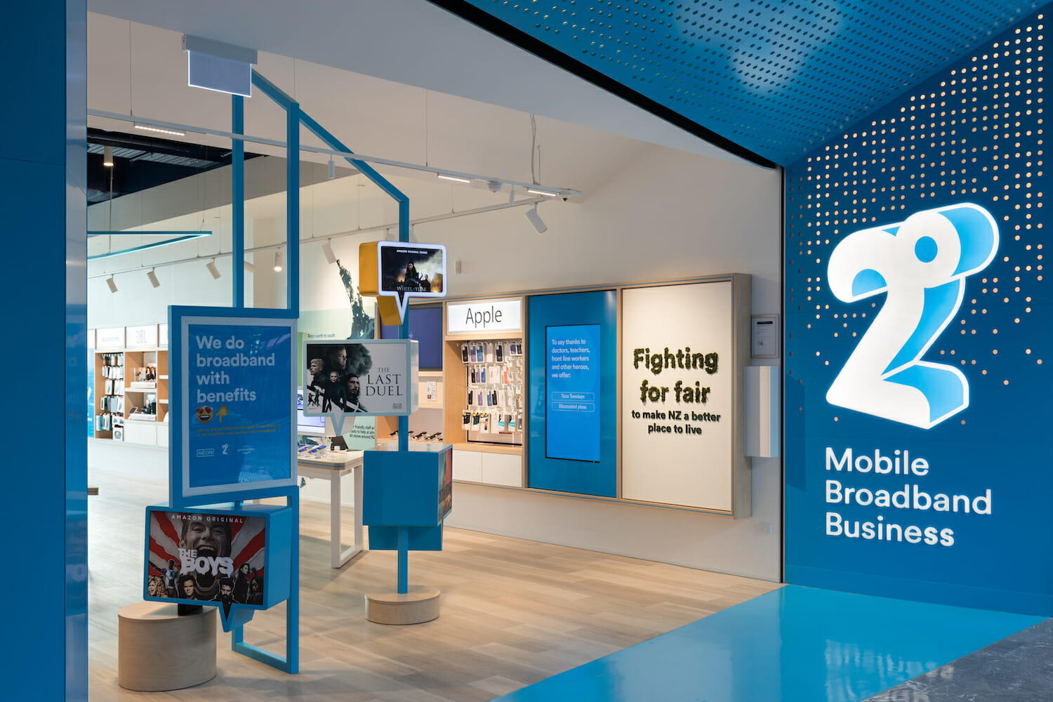
Customers are greeted with a bold and inviting entrance. A striking blue entry portal frames the store, naturally drawing people in. The angular shopfront design incorporates the brand’s hero blue alongside a unique perforated dot pattern—a subtle nod to the degree symbol.
When activated, the entry portal comes alive with dynamic lighting sequences, creating a visually engaging experience that captures attention and reflects the energy of the 2degrees brand.


Coloured Lighting
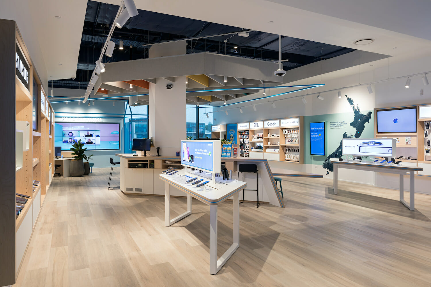
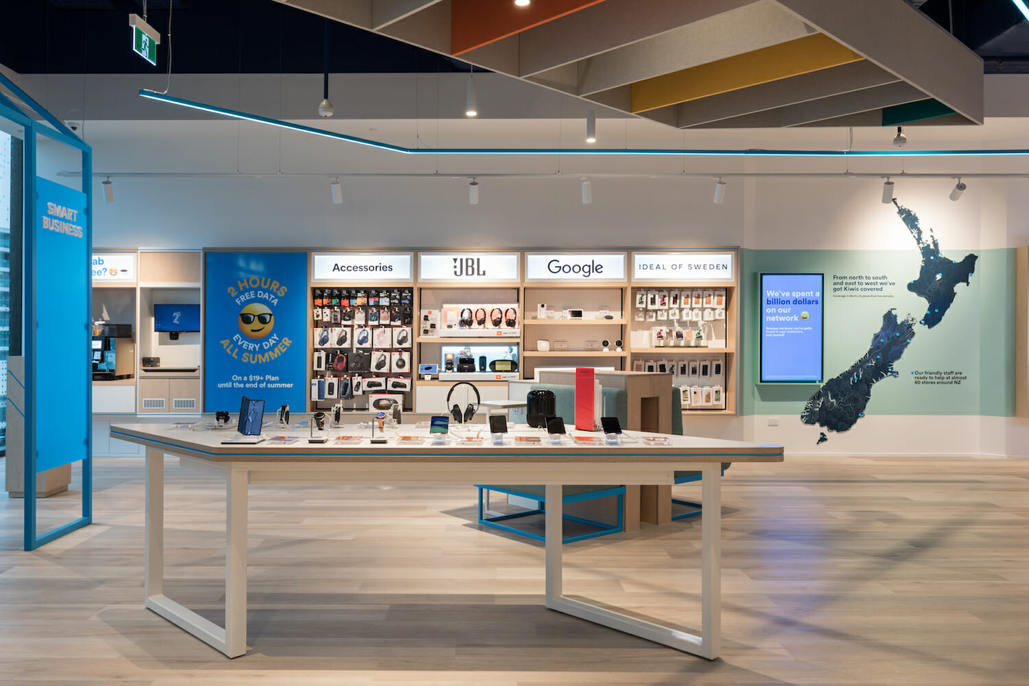
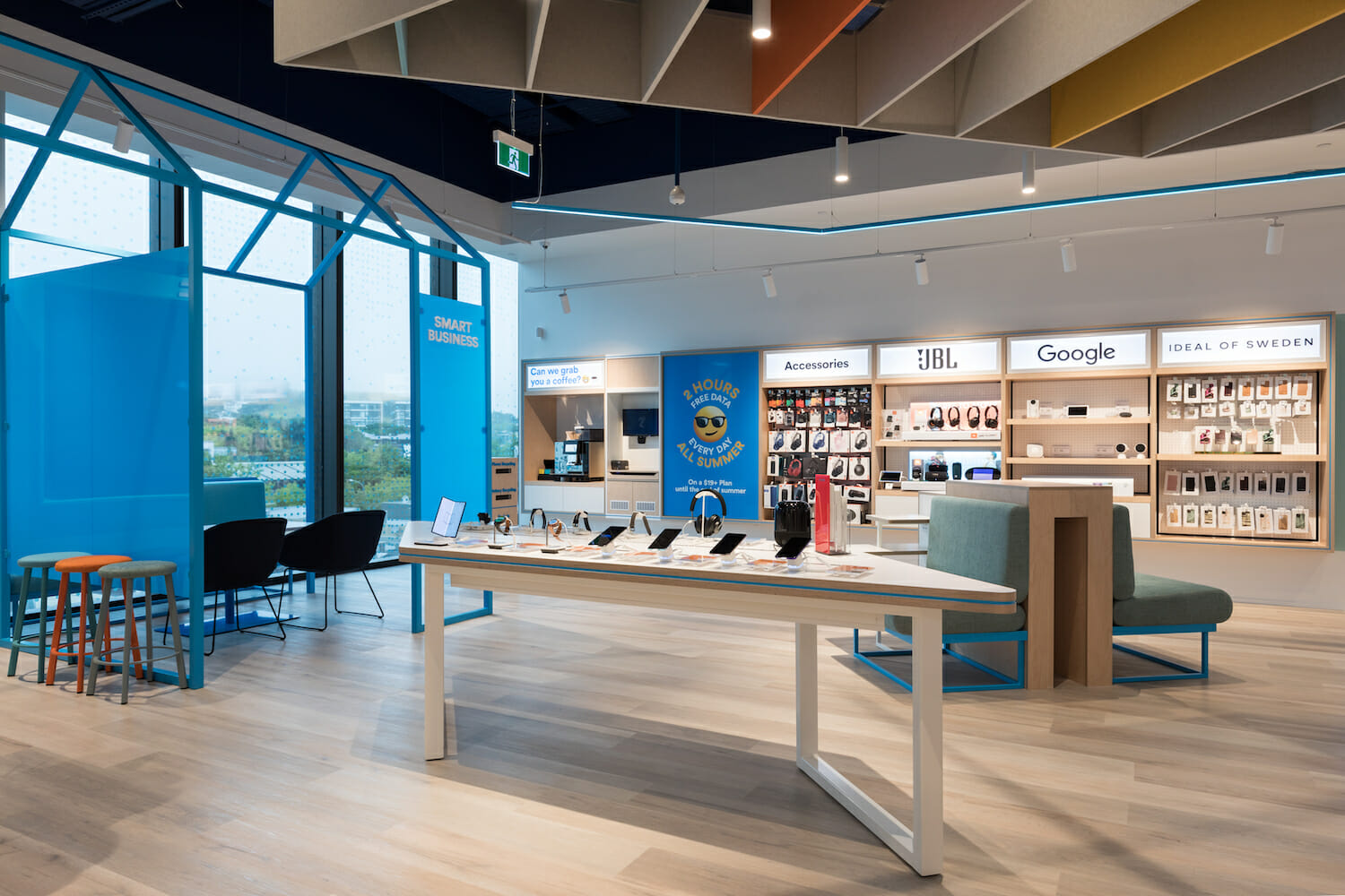
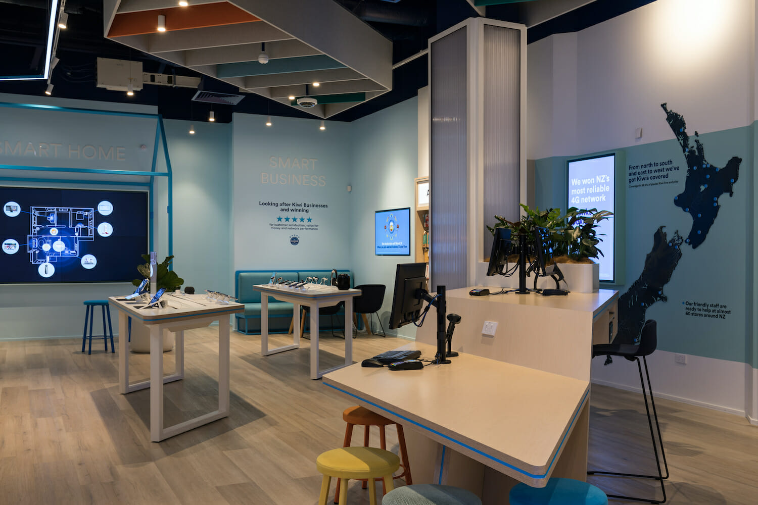
Coloured lighting has been used in strategic areas of the store. The guiding light of the blue LED extrusion provides a subtle visual connection between the shopfront display and the rear of the store; it leads the customer through the space back toward the home hub, bridging between mobile services and the smart home/smart business features. This hub area abstracts moments of ‘home’, bringing 2degrees and the home environment together. This was important given the increased work-from-home trend and the ever-increasing range of connectivity services within the home.
Branding
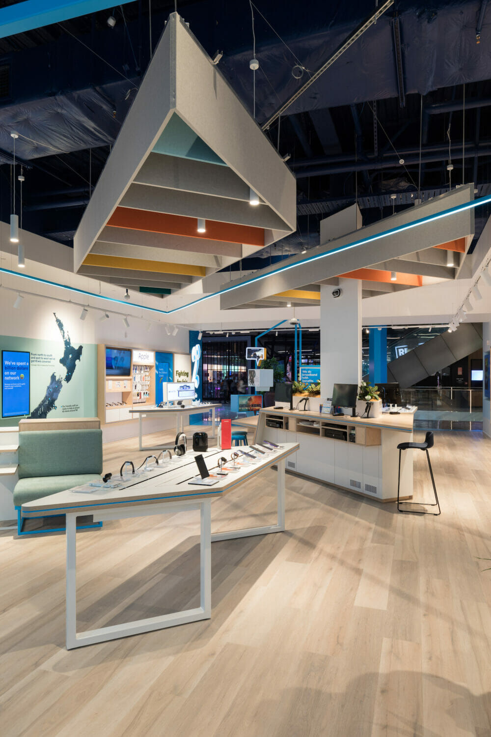
Branding is thoughtfully and seamlessly integrated throughout the store design. Subtle use of secondary colours defines architectural elements without overpowering the overall interior. Dark blue accents highlight the exposed ceiling, while pops of colour are woven into suspended ceiling features and furniture. The primary brand blue is cleverly incorporated into the joinery details, tying the design back to the 2degrees identity.
Playful nods to the brand are evident in the speech bubble display features and the “fighting for fair” tagline, crafted from preserved moss—a creative touch that reflects 2degrees’ commitment to sustainability.
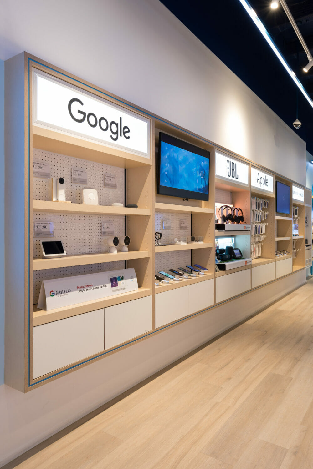
These carefully integrated brand elements preserve the playful, approachable voice of 2degrees while complementing the store’s clean, modern aesthetic. Recessed wall bays appear to float above neutral timber flooring, while crisp white walls and precisely placed spotlighting illuminate products beautifully. This combination creates a bright yet theatrical interior that elevates the store into a vibrant, sophisticated representation of the 2degrees brand.
Design Your Retail Store with Spaceworks
At Spaceworks, we understand that retail spaces are more than just physical stores—they are an extension of your brand and a vital touchpoint for customer engagement. The 2degrees flagship store is a testament to how thoughtful interior design can transform a retail environment into an immersive, functional, and vibrant experience that reflects a brand’s unique identity.
Whether you’re looking to create a flagship store, revamp your current space, or explore innovative ways to engage your customers, Spaceworks is here to help. With our expertise in retail interiors, we can bring your vision to life.
